Commissions
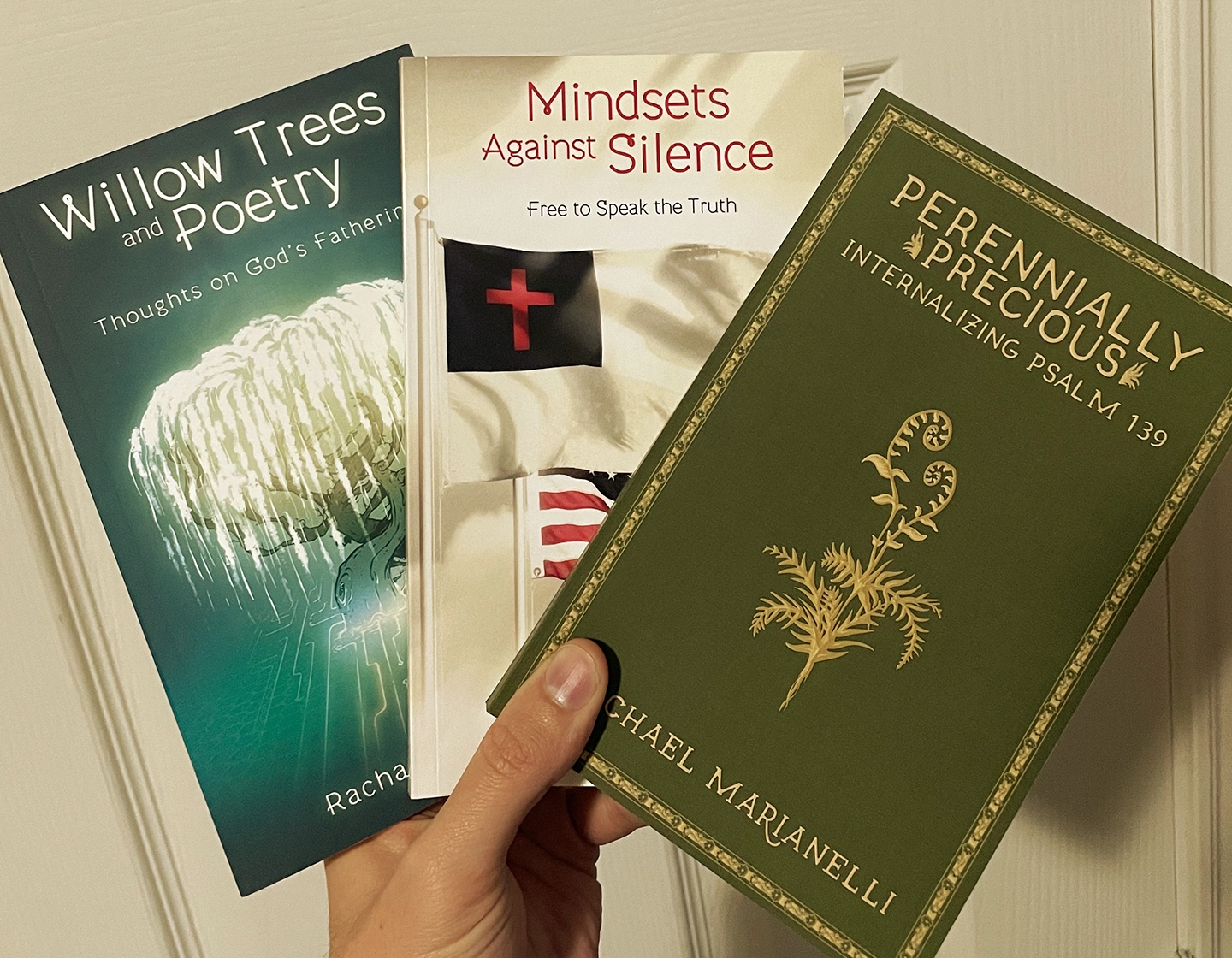
Besides being the love of my life and the mother of my children, my wife is also an incredibly talented writer. She'd always kept that aspect of her life very private, barely even discussing it with me, but a few years ago, it was as though her brain unlocked some video-game-style achievement, and she decided, "You know what? I'm just going to be a writer now". And write she did—two published poetry books, in fact.
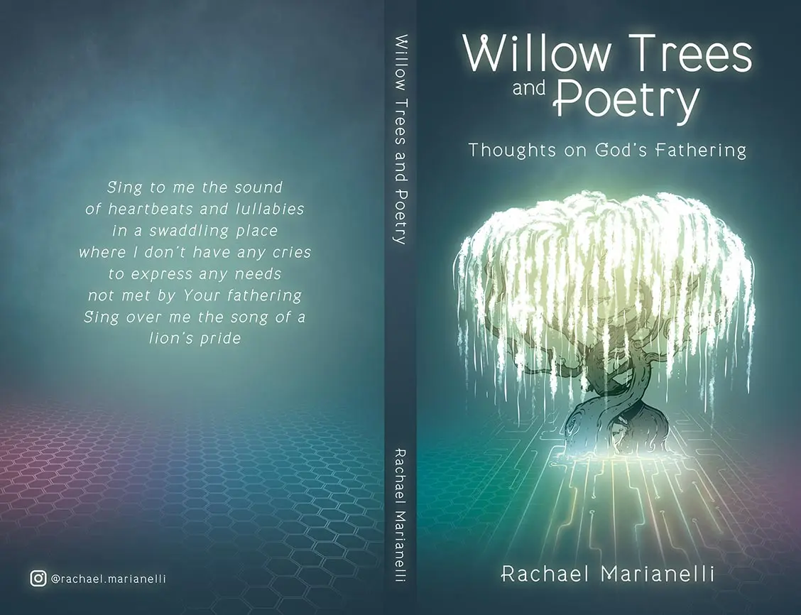
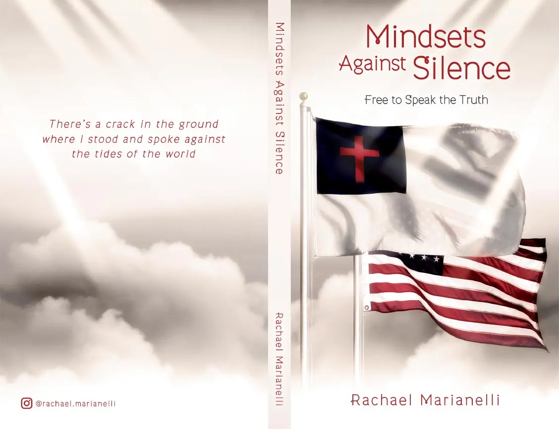
Now, why am I talking about my wife's incredible creative talent on a website devoted to myself? Because I happened to design the covers for those two incredible books. You could say she commissioned me, but I'm yet to receive payment for my services...
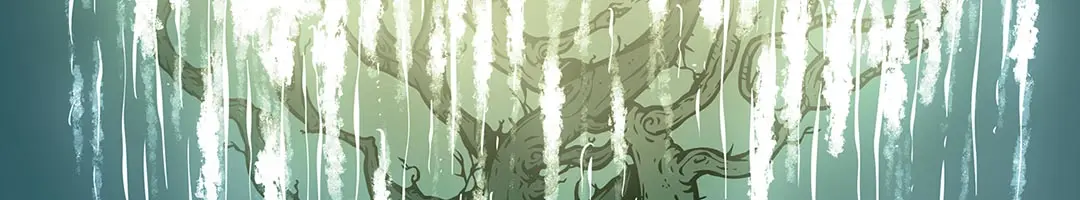
Willow Trees and Poetry: Thoughts on God's Fathering
Poetry on how God knows you and relates to you with themes such as inner healing, waiting, prophecy, identity, calling, freedom, faith, creativity, intimacy, origination, and eternity.
Mindsets Against Silence: Free to Speak the Truth
Before you use your first amendment right, you need encouragement to be bold and not censor yourself in a world that hates those that speak truth.
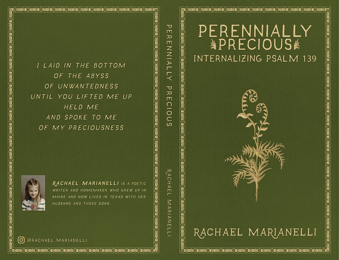
Perennially Precious: Internalizing Psalm 139
Writings to help you digest the truth of Psalm 139...
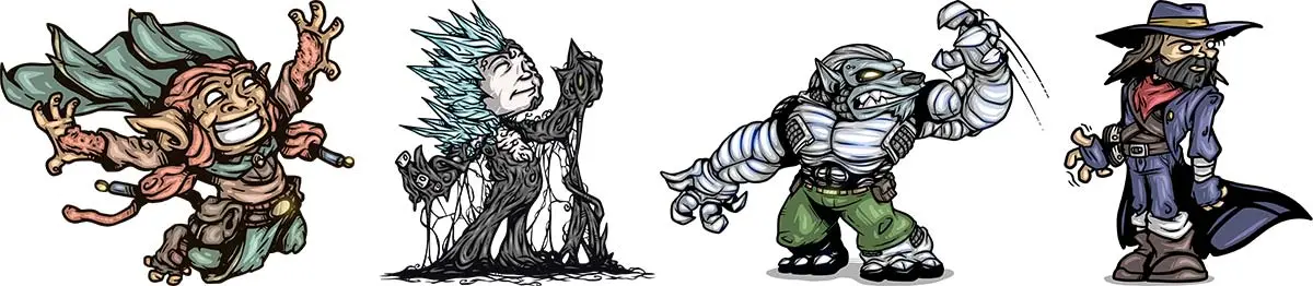
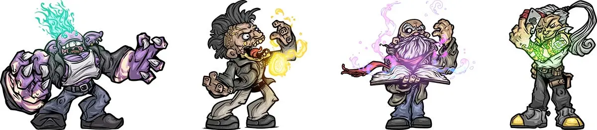
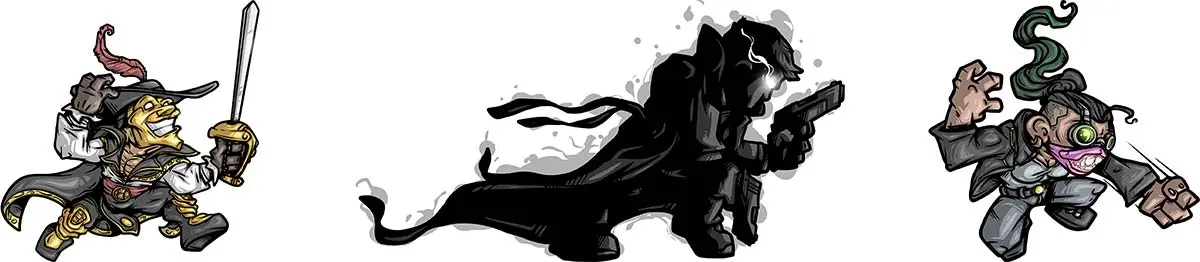
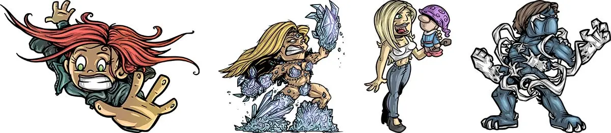
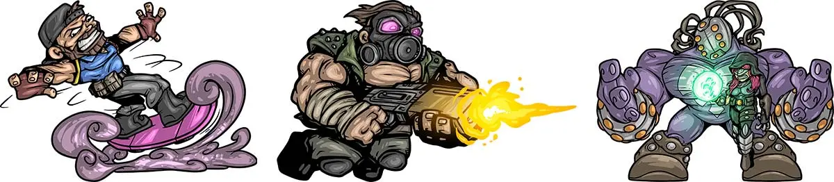
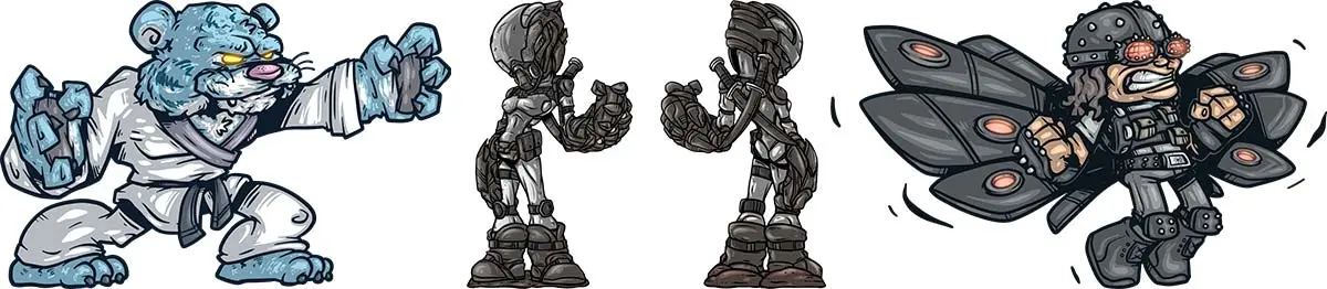
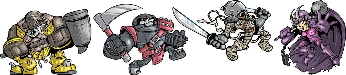
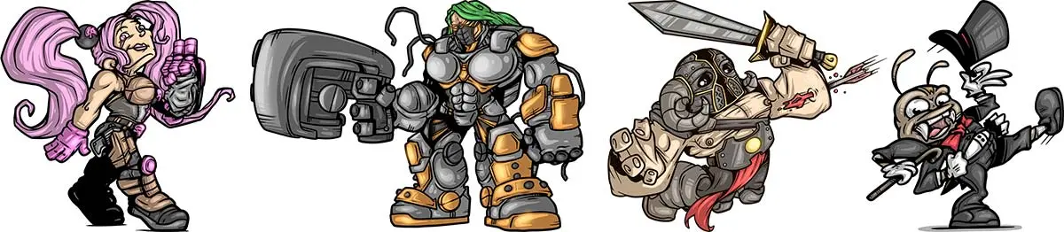
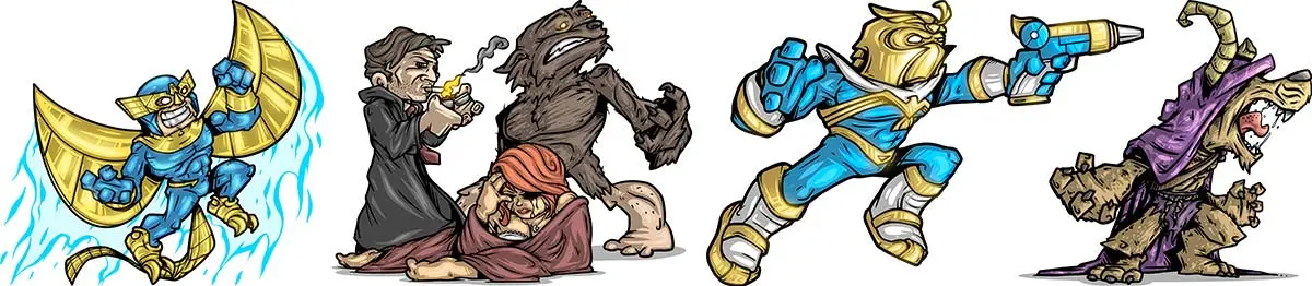
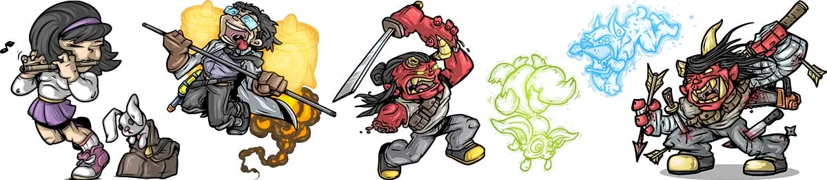
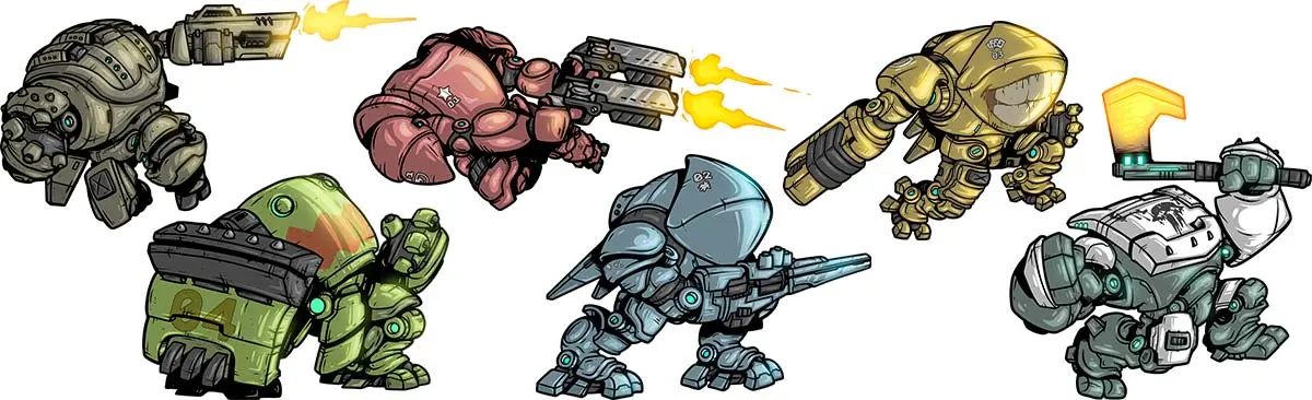
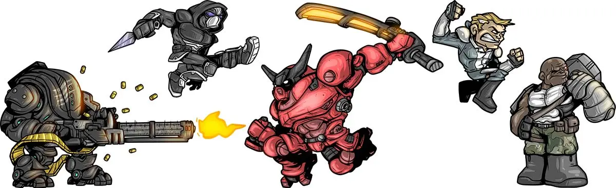
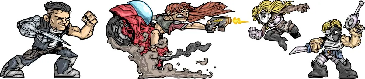
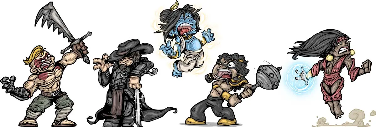
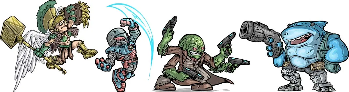
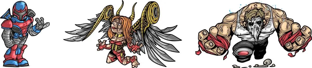
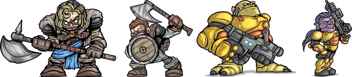
Star Fetched isn’t the only thing I’ve worked on with Crescent Moon Games; I’ve also gotten to do some pretty fun banner & logo work for a handful of other games that they’ve published. Here are just a handful of illustrations I’ve had the pleasure to create:
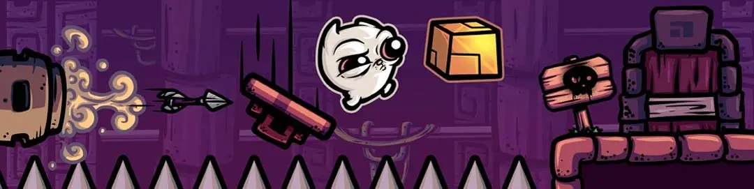
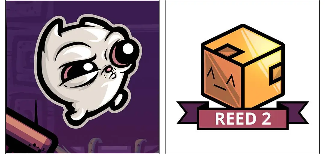
Reed 2
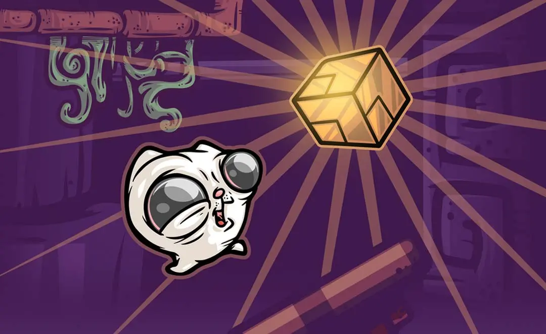
Reed 2 is a really fun platforming puzzle game where you play as an adorable fuzzy little critter who must go from room to room, finding secrets and collecting glowing cubes to unlock the exits and escape without getting viciously murdered by traps.
Reed Remastered
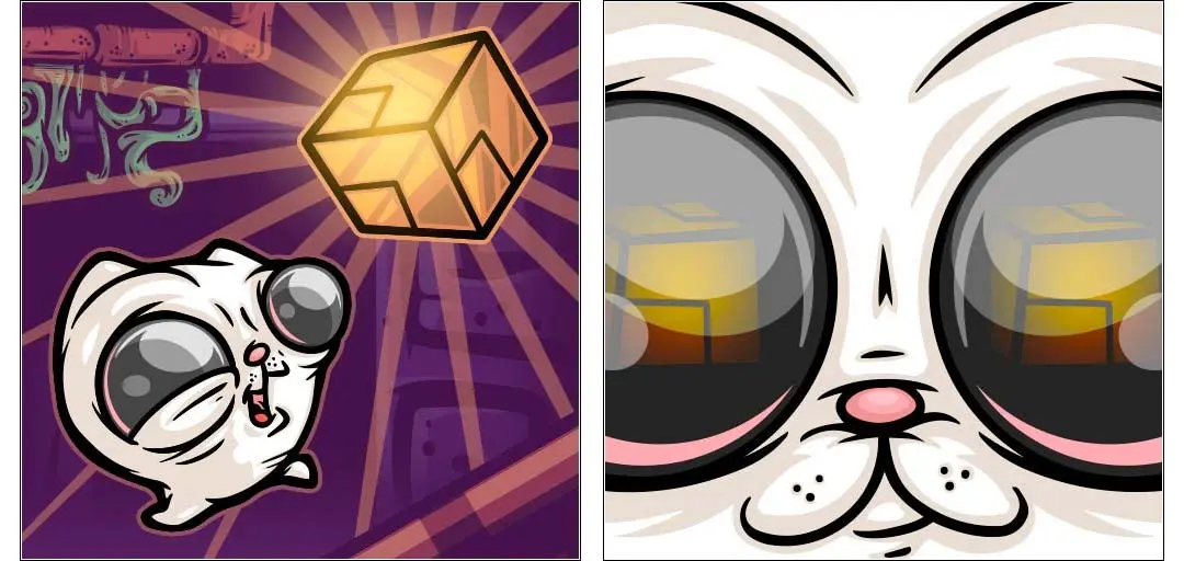
This was a remastered release for Reed 1. I wish I could say more about this other than that a year had passed between working on these two, so my drawing of Reed himself is slightly better. I hope.
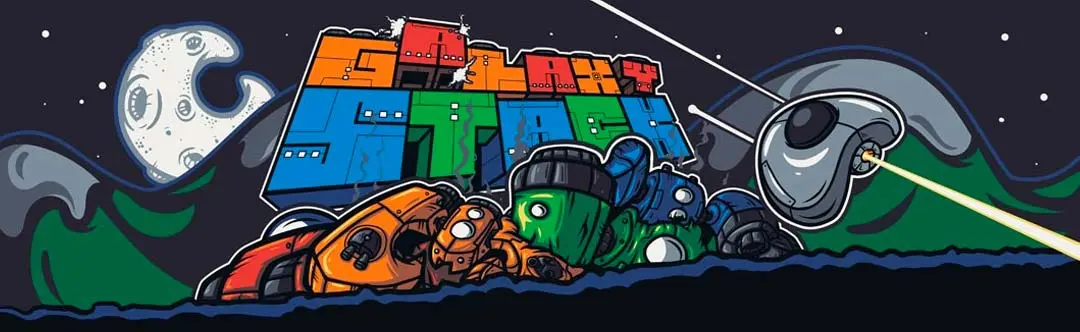
Galaxy Stack
This one I had the most fun illustrating. Galaxy Stack is a vertical scrolling space shooter that’s incredibly reminiscent of old-school arcade games, and the direction I received for creating the art was to design it to look just like that—an old-school arcade cabinet. This went through two variations, and the final version ended up being a glorious Frankenstein of both.
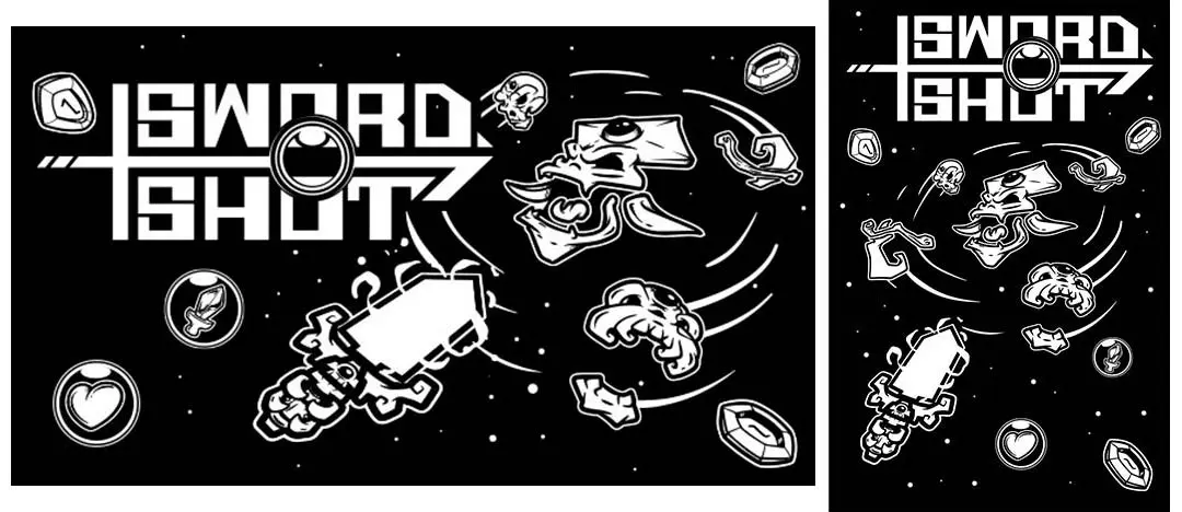
Sword Shot
Sword Shot is a black & white shooter where the goal is to shoot through a series of spinning objects in an attempt to kill the enemy at the center of those objects. It’s difficult as all get-out, but it’s a frustratingly good time. The simplicity of the graphics allowed me some freedom in the overall design of the banner, as I got to interpret slightly more detailed versions of the sprites. I also got to create the logo for this one as well.
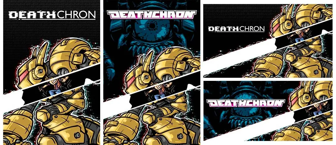
Deathchron
Words cannot express how genuinely excited I was for this game, and even more excited that I got to make the artwork for the banners. Deathchron is basically a mech version of Master Blaster. You’re a kid who has control of this giant robot, and you run and gun through all kinds of glorious pixel carnage. You can also exit the mech a la Master Blaster to perform exploratory tasks. For the artwork, I chose to use a streak of x-ray light going through the mech to reveal the boy controlling it from the inside. The boy’s t-shirt and chair design are homages to one of my favorite movies, Flight of the Navigator.
There are two versions. The original had a black background with binary code and a glitched-out game title. It was requested that I use the original logo (which I didn’t know existed at the time of designing it) and a background created by the lead artist on the game. It was a glorious marriage of the two designs.
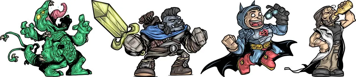
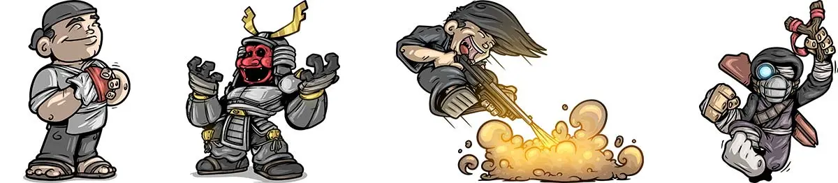
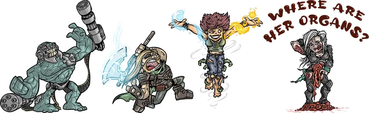
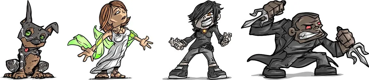
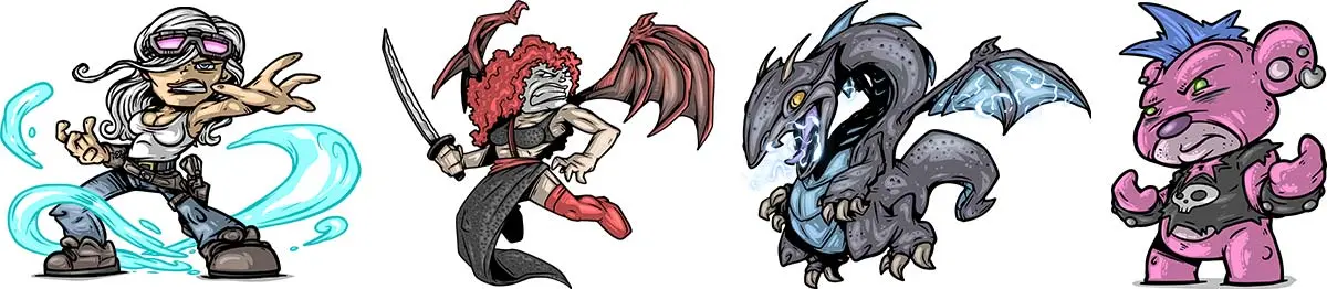
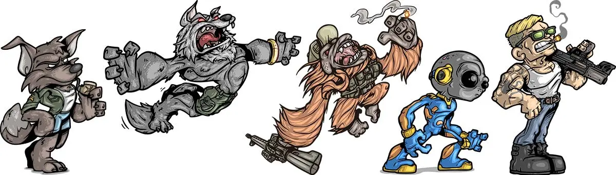
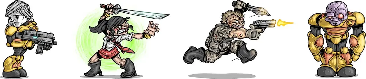
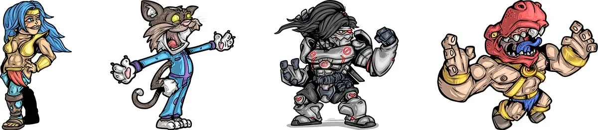
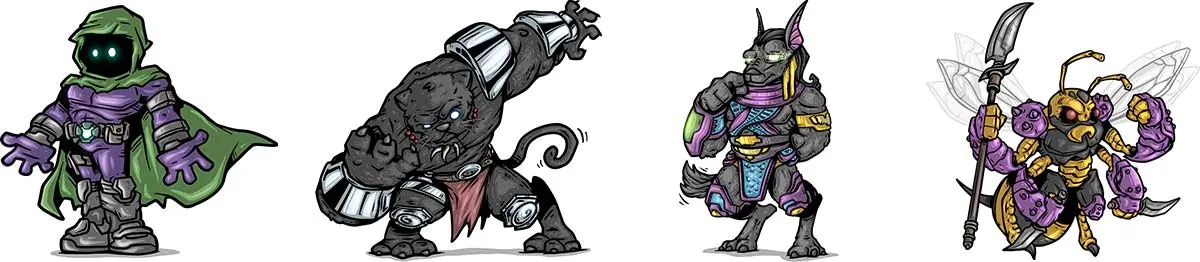
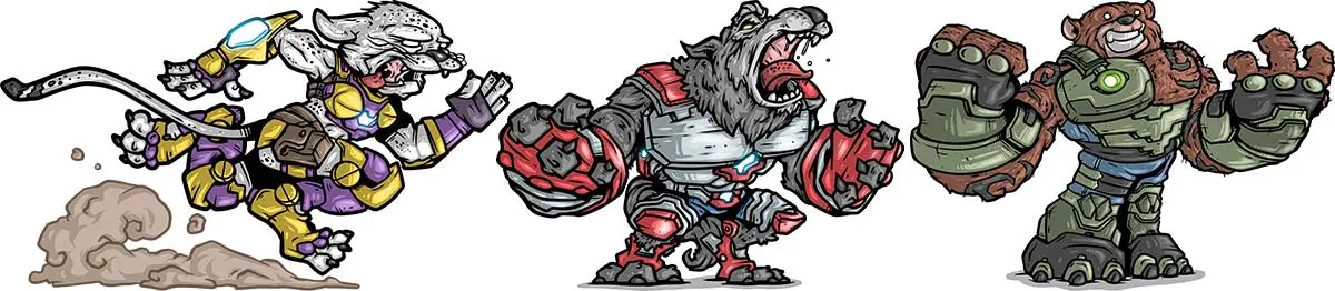
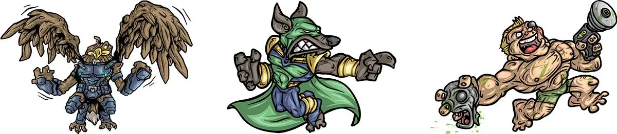
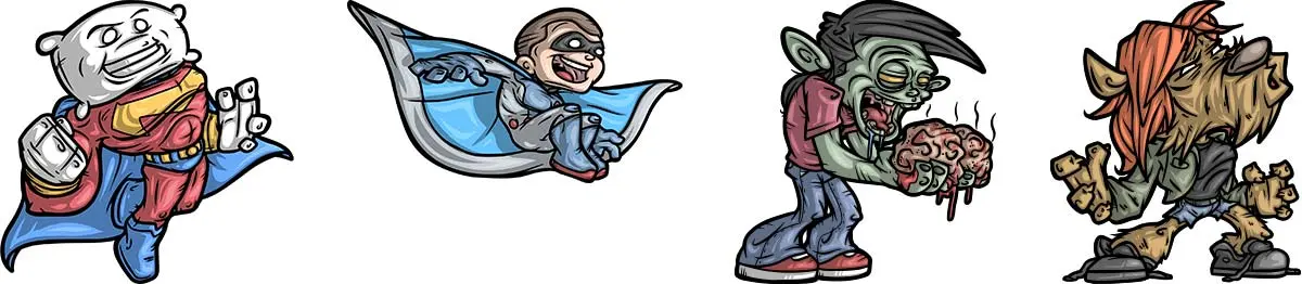
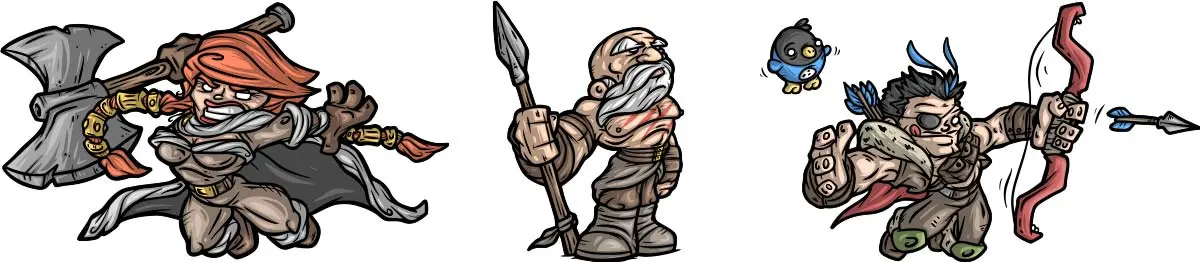
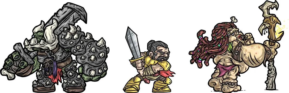
Somewhere along the way, I became known as the 'sticker guy' within a small sliver of the indie comics scene. It's a little insane just how many stickers I've actually created, and it's no wonder my wrists crack so easily these days.
Here's a sample of the stickers I've created (the ones I'm allowed to show, at least... I hope):
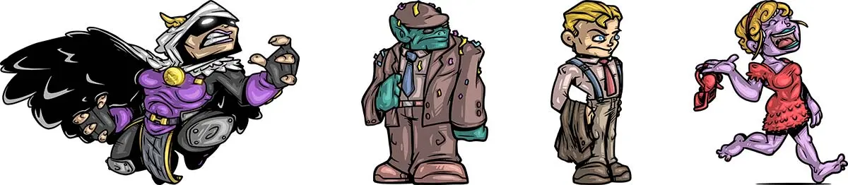
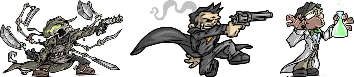
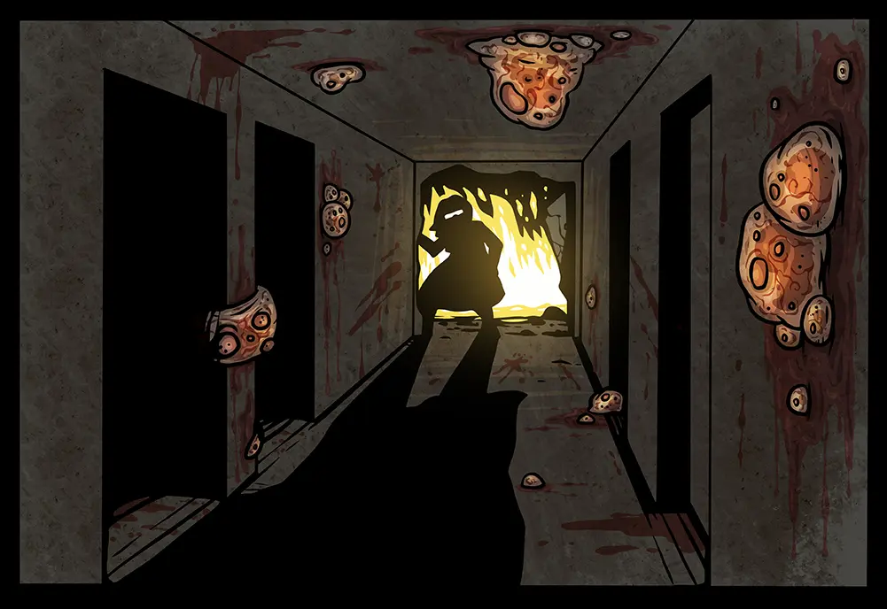
DRAG THE DEAD is a 3rd person zombie shooter developed by a good friend of mine, David Murdoch. Last year I was asked to illustrate a handful of cutscenes for the game, and illustrate them I did! I don't know how much I'm actually allowed to show, but seeing as the game has been available on Steam for a few months, I think it's safe to post a few items...
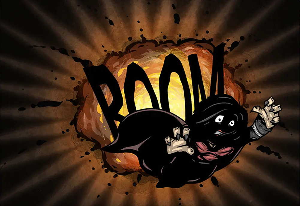
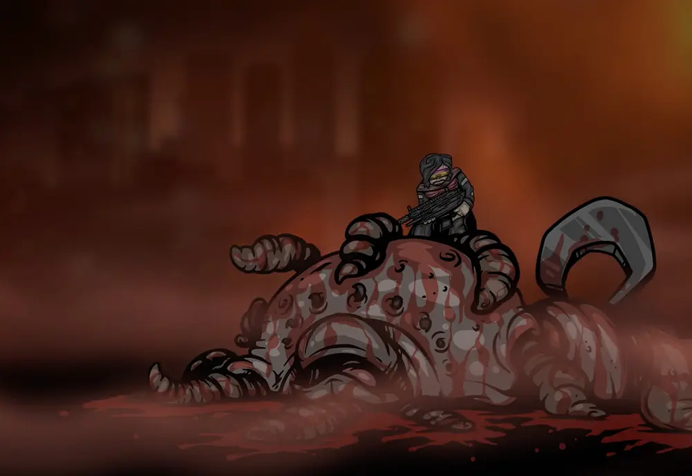
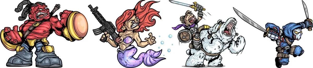
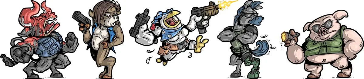
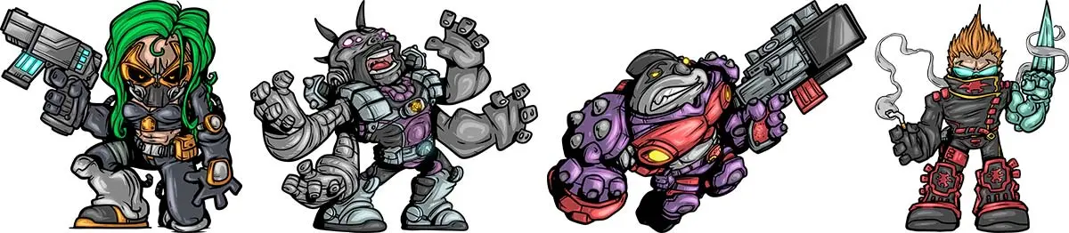
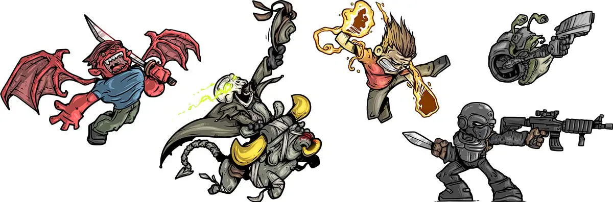
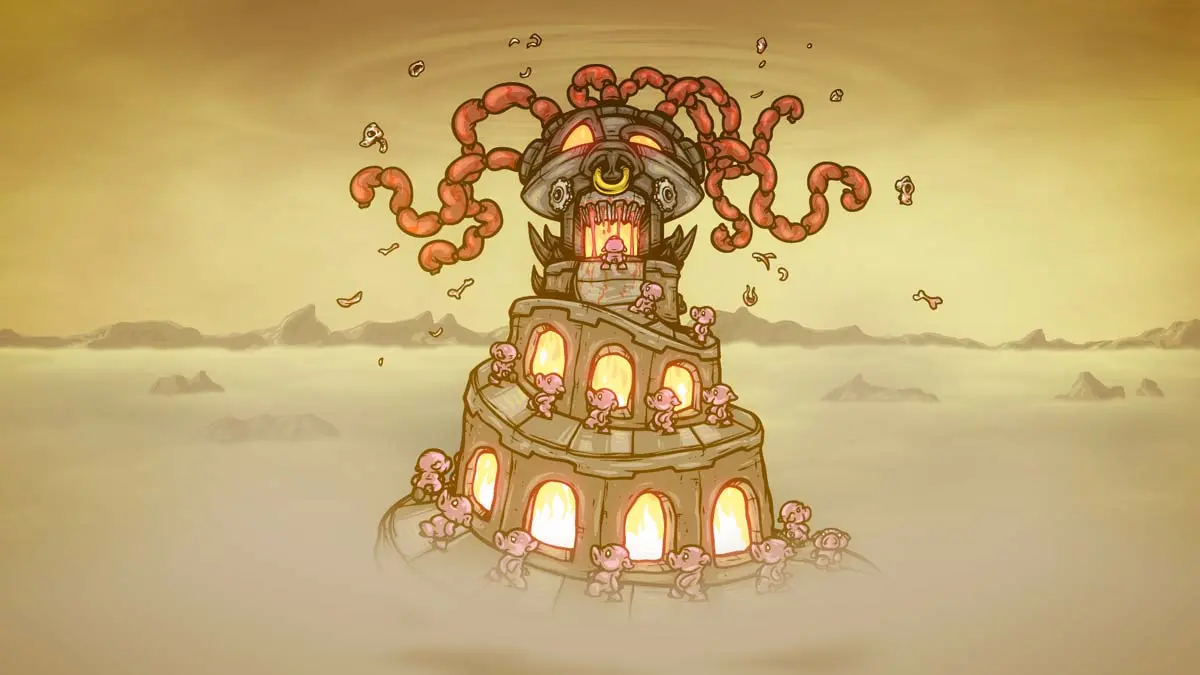
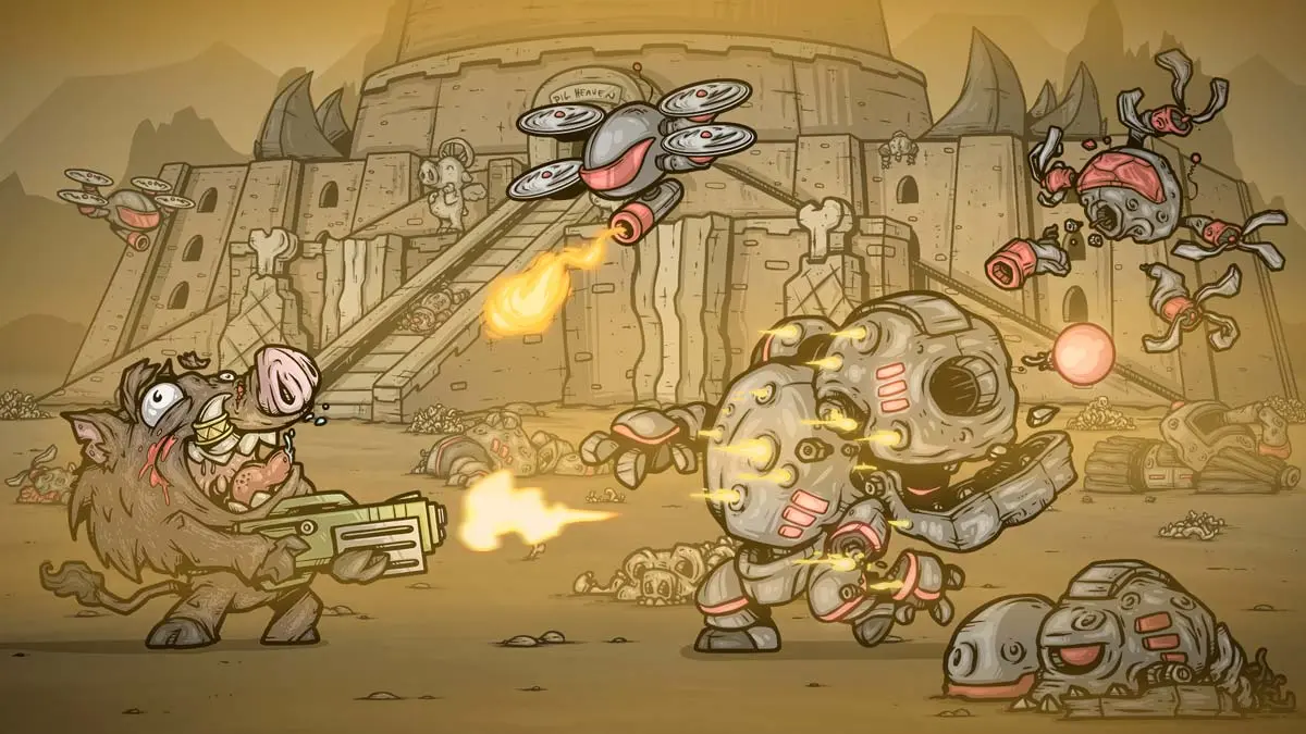
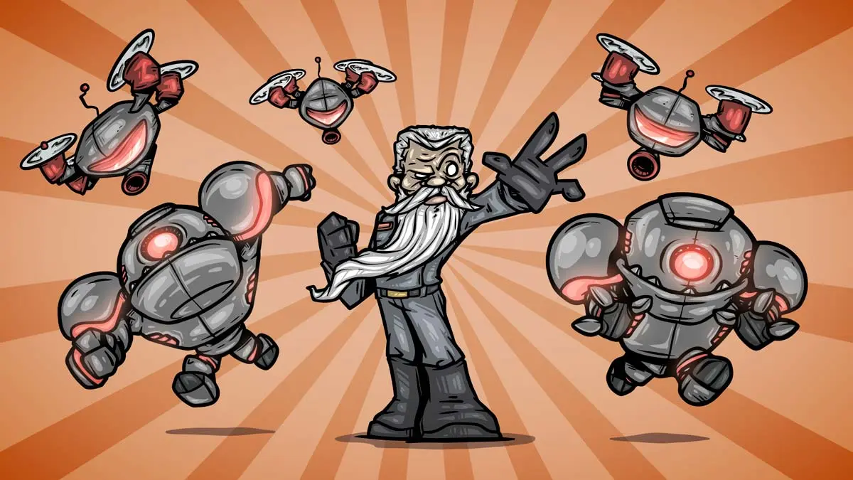
Cascadia Games is a game developer I had the pleasure of being introduced to through my work with Crescent Moon Games on Star Fetched. We had discussed potentially doing some work together when my game wrapped, but it wasn't until 2023 when I had the amazing opportunity to do some cutscene art for their game, "Guts n' Grunts," a side-scroller featuring a mutated boar who goes on a rampage against a bunch of cyborgs in an apocalyptic wasteland.
I'm not doing it justice; here's the official description from their Steam page:
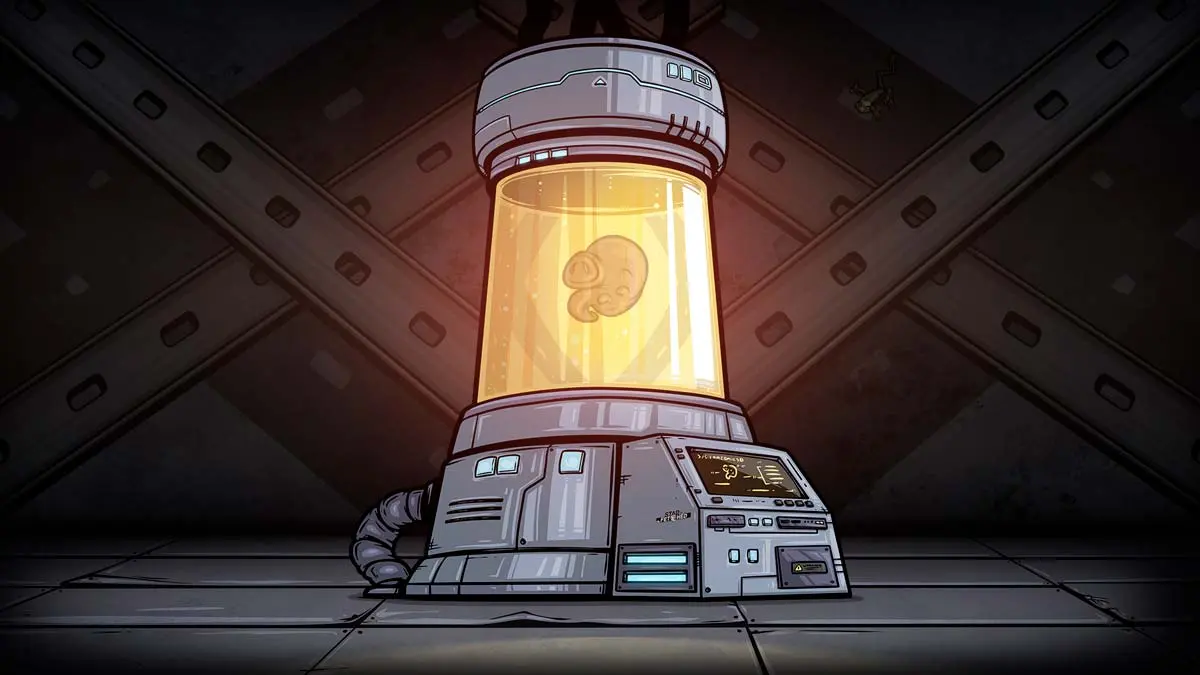
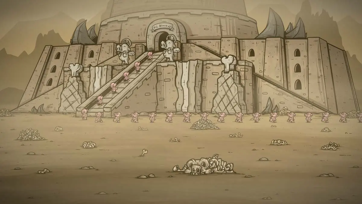
"APR 07, 2060. It has been 40 years since the Technate has taken control of the world. In their arrogance and gluttony, they created a breed of intelligent pig. These pigs were trained from birth to self slaughter when they reach mature age. For a time, the Technocrats enjoyed their meat.
Then, a special boar was born -- one hellbent on destroying the Technate and putting the pigs at their rightful place atop the tower. His name was Rudy Hammon."
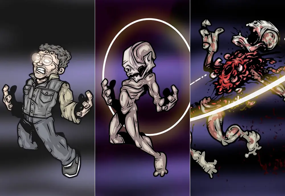
Here are the images from the opening cinematic. There's more art for various cutscenes throughout the game, but I don't think I'm allowed to show any of that yet.
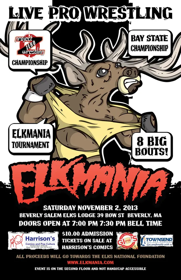
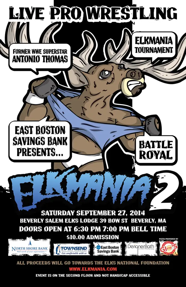
A friend of mine (Mr. Atlee Greene) was putting on a wrestling show where all of the money raised was donated to the Elks National Foundation, which contributes to scholarships, veterans services, and youth programs. The name of the show was named "ELKMANIA" (since it took place at the Elks Lodge).
Having done work with him before, I agreed to help him out with a promotional poster. Naturally, being a play on 'Hulkamania' while representing the Elk's lodge meant that the design could only go in one direction...
There was also an Elkmania II the following year, which required a few minor tweaks to the original, this time going with Hulk Hogan's 'No Holds Barred' colors:
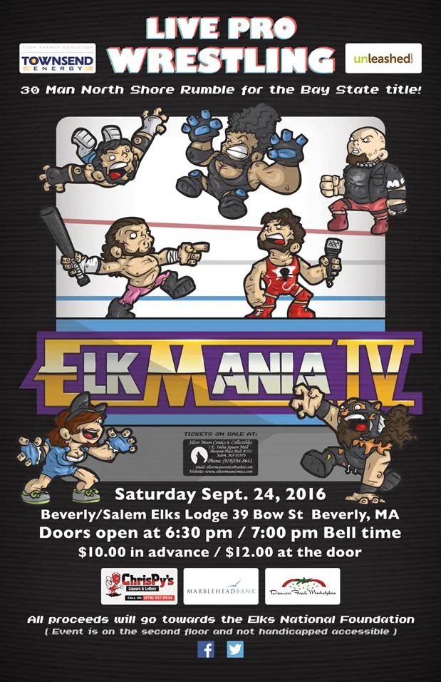
I had to miss the Elkmania 3 poster as I was in the process of a big move (Texas, baby!), plus with all the Gawker stuff going on around that time, I don't think anybody was interested in Elk Hogan. However, in 2016, I was available to design the poster for Elkmania IV, this time creating illustrations of the headlining wrestlers and a new logo reminiscent of 80s Wrestlemania... I say reminiscent, but what I mean is 'blatant rip-off'.
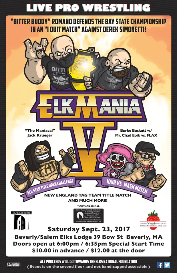
Onward to Elkmania V, 2017. This time the plan was to model the logo after the Wrestlemania V promotional material, because I'm all about originality. Rather than go with the Royal Rumble look and feel from the last poster, I went with upper body shots of the headliners because I'm too lazy to draw legs and feet.
My boy Atlee had an idea for Elkmania VI that tickled all of my fancies. He wanted the design to take inspiration from the cover art for 'Uncanny X-Men #141' (which he didn't realize is my all-time favorite comicbook cover ever). Challenge accepted.
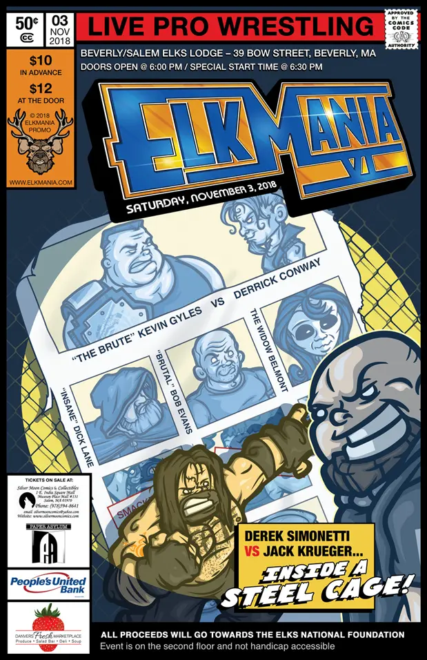
You'll notice in the upper left corner, where you'd typically see the comic heroes' faces, there's a fancy-looking elk. Around this time, I was asked to take an existing early design for the Elkmania logo and make it all nice-looking.